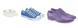
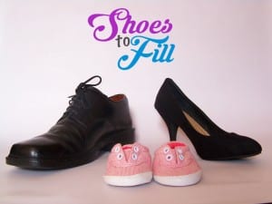
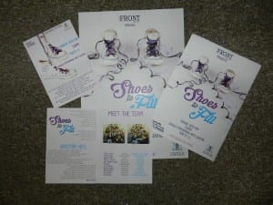
Throughout the process one of the main things we had to consider through the marketing and the show is how cohesive it all was, how well it all worked together. One main way of doing this was having a colour scheme we settled on a dark rich purple, that you would associate with Cadburys, a turquoise blue and a warm grey. The purple is present in our company logo as well as the show logo, and other work, clearly and noticeably linking them.


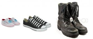
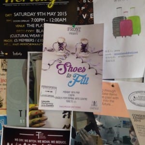
The only struggle I have had with the creation of posters and flyers was that I wanted something that would clearly link to our show, but with it being in the development process it was hard to find one image that could reflect it without have a finished piece. Some themes that were constant throughout the process however were the use of shoes and the different stages of life, almost like a time line.
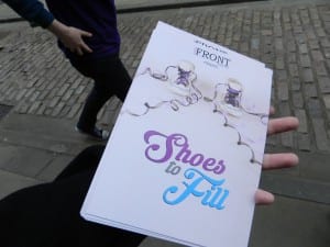
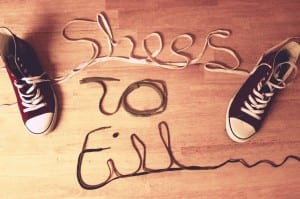
We used a converse style shoe as our main image, as it is very universally known shoe and as it was a white shoe it worked well with the injection of our colour scheme around it. We also used very long ribbons as the laces; it reflects our idea of a time line. This however was also affected by the con of not having a final piece, as we were originally going to use the ribbon in a choreographed dance piece in the performance but instead this was developed into a more realistic tender moment of a dance between a couple, it no longer linked back to the marketing but it did work better with the rest of the show.
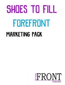
We also made sure we used the same images online as well as the same fonts throughout or work, Dk Snemand and Krinkes can be seen in the poster, flyers, programme and marketing pack.
We definetly had a development of the image throughout our process from our very first copy image to the one used as our poster at the end, the ability to learn new skills has been vital to our visual marketing as I have learnt how to use a DSLR camera, lighting and photoshop to create a more polished and proffesional product in the end.
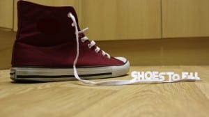
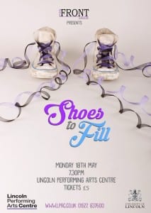
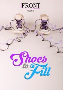
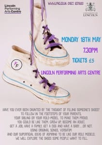
“Through the power of distinctive, dynamic design, businesses can harness the immense potential of event branding – but it’s only through an intelligent and cohesive approach that you’ll experience the full effect.” (Atkinson, 2015) Haveing a few products, the flyers, posters, online presence and programmes, it is important that they all stay recongnisable, making sure we avoid creating any confusion and instead send out a clear message that tells a viewer about our show and how they can access all the information about it. Minus the copy image I believe we achieved this and therefore were able to build a strong relationship with our audience. Our colour scheme and the use of shoes instead of a person on our work allowed us stand out from many other companies.
Atikinson, Tori. 2015. Experiential Design: the Importance of Cohesive Event Branding. London.
-Hope

